Chicago Ridehail: Trips Dashboard

Published

July 31, 2026

Introduction

This set of charts uses the Chicago Trips data set to check monthly trends. To make the analysis more tractable, it uses the trips on the first Thursday of each month as representative of the whole month.

It hopes to capture both sudden changes and continuing trends in the overall ridehail landscape in Chicago. The data set does not include earnings data or driver time spent en route to pick up passengers or waiting for a trip request.

The month at a glance

Table 1 summarizes the headline numbers for in June 2026, alongside how each has moved compared to last month and to a year earlier. Any driver who completes 240 or more trips is considered “Full time”: see Figure 5 for more details on this choice.

Table 1: Chicago ridehail drivers at a glance
Metric Value vs last month vs a year ago
Average trips per day 240,398 -3.1% -5.7%
Active drivers 58,357 -0.7% -4.3%
Drivers full time (>= 250 trips) 15.1% -2.2 pp -0.6 pp
Trips by full-time drivers 45.5% -4.3 pp -1.6 pp
Driver starts 7,838 -2.6% -12.1%
Driver quits 8,399 -2.6% -7.2%

Of the 60,993 drivers active in June 2025, an estimated 55.4% are now inactive, in June 2026.

Trip volume

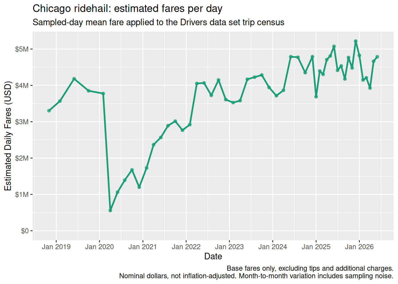
Trip volume, from Trips data set

Trip volume, from Drivers data set

Figure 1 shows the total number of trips, displayed as “trips per day” average for each month.

There are a few periods:

  1. Expansion until about 300,000 daily trips at the beginning of 2018
  2. Flatlining at around 300,000 trips per day during 2018 and 2019
  3. Covid-driven collapse in early 2020 followed by steady recovery.
  4. A pleateau, starting in 2024, at about 250,000 trips per day, still somewhat less than the peak period of 2018-2019.

250,000 trips per month is equivalent to just over 10,000 per hour, or about 175 per minute.
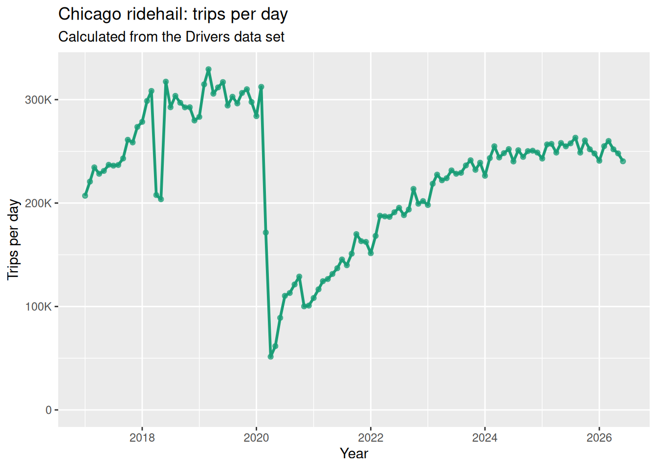
Figure 1: Average number of daily trips in each month

Driver population

Figure 2 shows the total number of active drivers each month (drivers who have driven at least one trip).

Regarding the outliers in Q2 2018, there is a note on the City of Chicago web site:

[S]ome vehicle records for Q2 2018 (April-June) were reported for the quarter as a whole, rather than for individual months. For purposes of this dataset, those records have been assigned to 2018-06 (June). Therefore, some caution in interpreting this month and the quarter as a whole is advised.
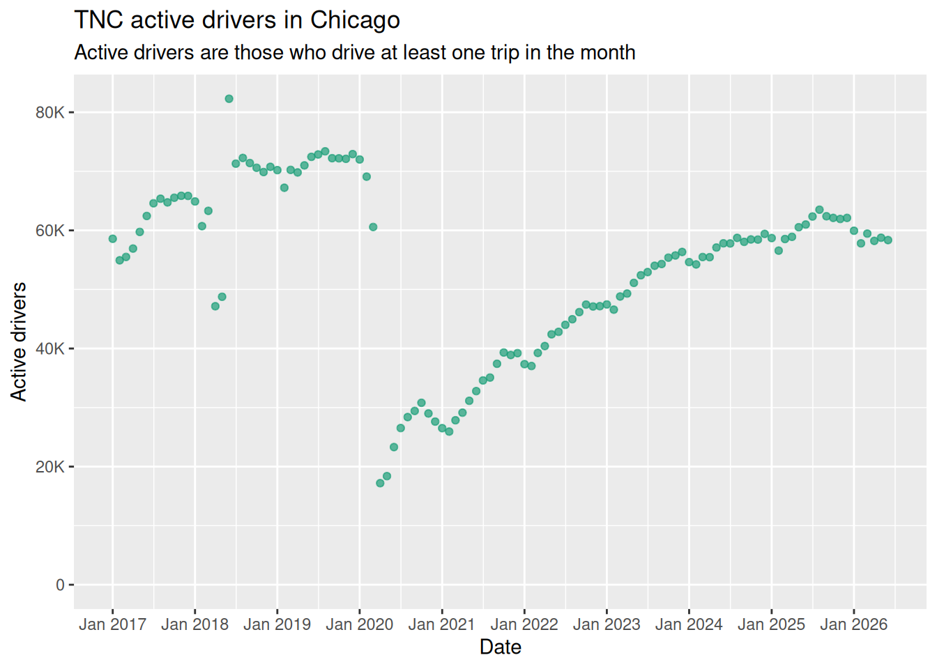
Figure 2

Driver activity

Trips per driver

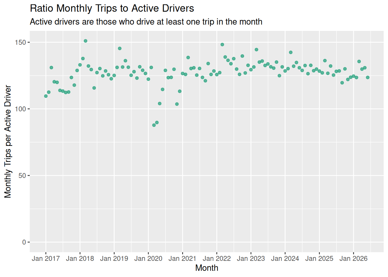
Figure 3 shows the average (mean) number of monthly trips per active driver in Chicago, which has stayed consistent at 125 to 150 trips per month, over a long period, with the major deviation being the Covid collapse. A more detailed picture of driver activity is given below.

Figure 3

Drivers, by trips driven

There is no one Uber driver. To understand how Uber operates, it helps to know what the range of driver participation is. Some drive only occasionally, some drive full time.

Figure 4 shows driver activity by number of trips per driver. Most drivers give only a few trips, but there are a small number of drivers who give many trips.

Figure 4

For June 2026, of the 86,195 total drivers, 27,838 (32.3%) took no trips at all, leaving 58,357 (67.7%) active drivers.

Categorizing drivers

To look at driver activity in more detail, it helps to categorize drivers as “full-time” or “part-time”. The line dividing the two is inevitably artificial, but it still helps to make sense of the driver population.

The Chicago data set does not provide driver times on the platform. The nearest we get is the number of trips in the month.

Using an average of 20 minutes per trip (from the Trips data set) and a utilization rate of 66% (a generous estimate from Fehr & Peers) gives two trips per hour. A 30 hour week translates into 60 trips, which is about 250 trips per month.

Any attempt to divide the distribution into categories is a bit arbitrary, but this section shows a few categorization schemes.

Seattle classification

The Seattle classification of Hyman et al to map that onto the Chicago data. The categories are:

Category Trips Estimated hours / week
1 < 40 < 5
2 41 – 160 5 – 20
3 161 – 240 20 – 30
4 241 – 320 30 – 40
5 > 320 > 40

The proportion of Casual drivers fell off quickly from 2016 to 2018, and the number of part-time (160-240) and full-time drivers rose. Since then, the composition has changed only a little.

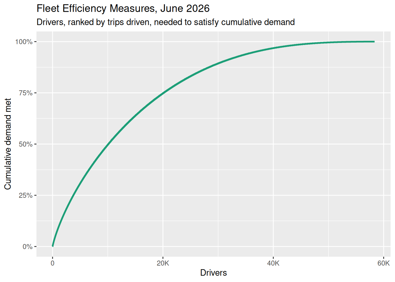
Figure 5 uses 250 trips per month to separate full-time and part-time drivers, or about 31 hours per month, to show how the market is divided between the two groups (or ends of the spectrum). It shows that even though full-time drivers make up less than a fifth of all drivers, they are responsible for about half of all trips. The statistics have remained remarkably constant over time.

Full-timers and part-timers are both essential to Uber and Lyft’s ability to deliver the volume of trips they handle. But these two groups do not always share the same interests.

Figure 5

Here are the values for the most recent month:

Full-time drivers, June 2026
Measure Value
% of drivers who are full time 15.1%
% of trips by full-time drivers 45.5%

Mean and median number of trips per driver

Although there is no “one type of Uber driver”, averages may still be useful to track trends.

?@fig-trips-per-driver-sql shows both the mean and median trips per active driver. The mean (which we showed above) is the total number of trips divided by the total number of drivers. The median is the number of trips for a “typical driver”, in the middle of the driver population.

Both the mean and median trips per month have been consistent for some time, showing that the basic nature of the driver population has been roughly unchanged for several years.

Driver longevity and churn

Although the driver population may look the same now as it did years ago, that doesn’t mean it’s the same drivers. In this section we look at how long drivers stay on the platform, and how the churn affects passenger experience.

New starts and quits, by month

The change in driver numbers is the difference between the number that start work on a TNC platform and those that quit. Figure 6 shows both of those numbers over recent years. This continual flux of drivers in and out of the market shape other charts, below.

Figure 6

Drivers quitting the platform

Figure 7 shows how long drivers last on the platform. It shows what percentage of drivers are still working after a number of months, adding up numbers for all starting months since 2016.

The increase in number of drivers in the first month is reflects onboarding time: the chart displays all activer drivers and compares the number to the “driver_start_month” in the data set. Each driver has a “driver_start_month”, but some do not start driving on the platform until the following month and hence only appear in the data set with a lag of one.

Figure 7

?@fig-driver-churn-facet shows how many drivers quit over their first year. The proportion is calculated by taking the number of drivers who start in a given month and who have trips in the month one year after that, and dividing by the number of drivers who start in a given month and who are present one month after that.

In recent years, fewer than 20% of drivers stay longer than a year.

Current driver population by longevity

Figure 8 shows the driver population for the most recent month in the data set, and shows the distribution of drivers, by longevity, on the platform in that month.

  • The biggest single group of drivers are those new to the platform.
  • The typical driver has been on the platform for less than a year.
  • The average driver longevity is just over two years.
Figure 8

The evolution of longevity

It can be easier to interpret this if we lump drivers into new or long-term workers, based on whether they have been on the platform for more or less than a year.

Figure 9

Driver mean and median longevity over time

Both mean and median longevity (below) confirm the observation that the driver population has been on the platform for longer, over time, albeit with a major Covid interruption.

The Chicago data does not allow us to see whether drivers have gaps in their work: we just have a first month they are recognized and the reporting month.

The typical driver has now been on the platform for almost a year. Drivers who drive more trips have, on average, been on the platform just a little longer.

Trip distribution by driver longevity

In a given month, how many trips are given by drivers with a residency of X months?

Warning: Removed 395 rows containing missing values or values outside the scale range
(`geom_line()`).

Now do this over all months, not just an individual month, summing over the longevity of the driver.

Fares

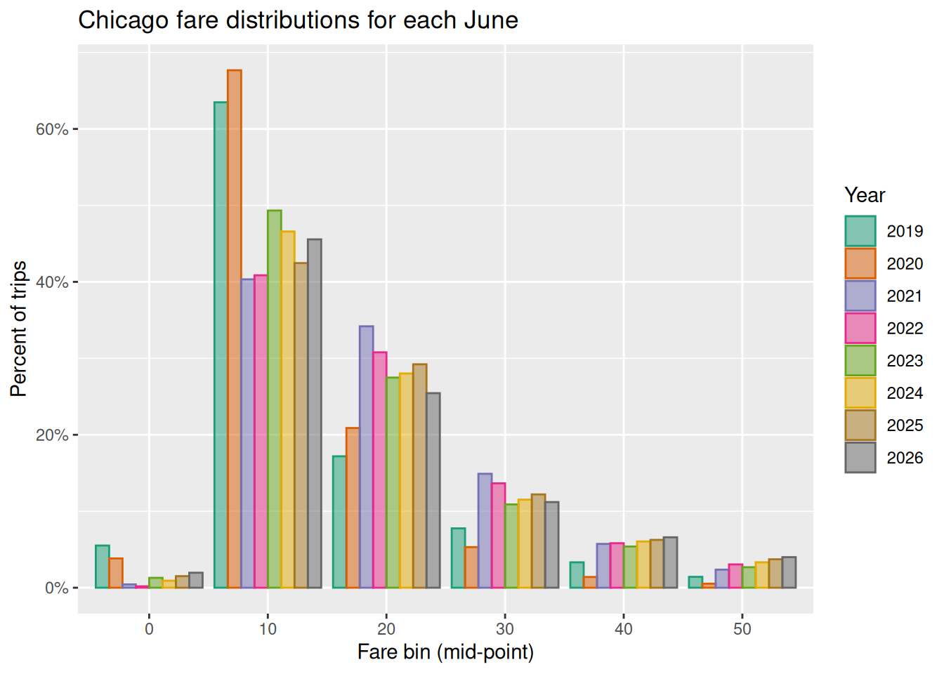
Fare distribution

Figure 10

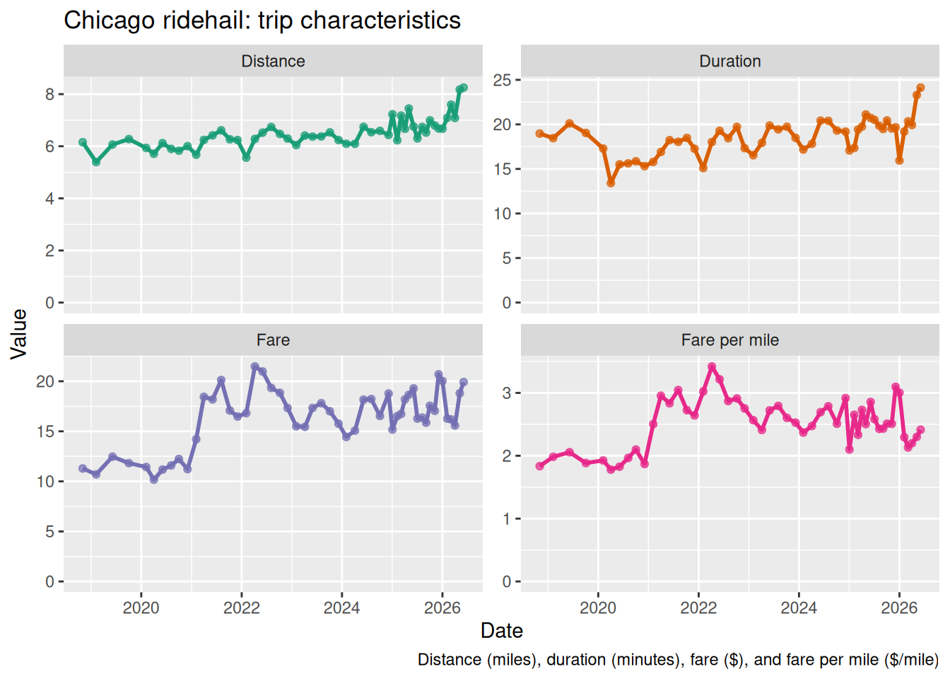
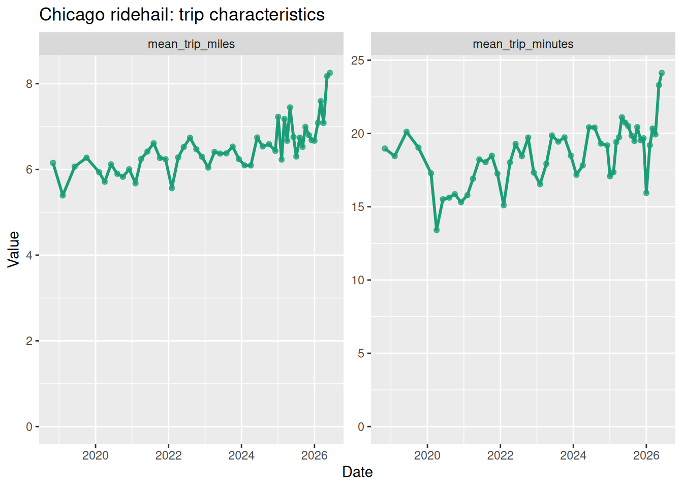
Average trip characteristics

Figure 11

Geography: Community Area map

Community area map

Thanks to Daryn Ramsden’s geojson representation of Community Areas, we can display the community areas as a map. It shows how trips are concentrated in the downtown area and at Chicago O’Hare International Airport.

Figure 12

Geography: trips by Community Area

Chicago has 77 community areas, listed here. Chicago trip data is broken down by community area.

Figure 13

Geography: downtown and elsewhere

We can identify a small set of community areas as “downtown”: these are community areas 8 (Near North Side), 28 (Near West Side), 32 (Loop), and 33 (Near South Side).

Covid caused a shift away from downtown, but downtown remains responsible for about a third of all trips.

Additional charges

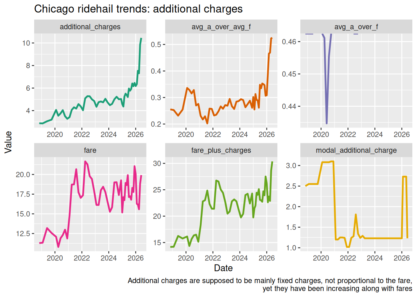
Fares include additional charges (tolls and so on) that are listed in the data set. Figure 14 shows how these have changed over time.

Figure 14

Algorithmic fares

Fares and earnings were originally set using a “rate card” model of a base fare plus per-minute and per-mile rates, sometimes with a surge pricing multiplier. With the introduction of “upfront pricing”, Uber can set prices individually for trips, based on many factors.

One way to look at algorithmic fares is to fit the fares for a given month to a “rate card” model and then to look at the deviation from that model, which is the “Residual Standard Error” (RSE) of the fit. A larger RSE means that the individualized (per-trip) algorithmic components have a bigger impact on the passenger fare.

Community Area-based deviations

Although we cannot unpick all the factors that shape Uber’s pricing algorithm, Figure 15 shows how the fare for trips starting in each community area deviates from the best “rate card” fit for the month.

Figure 15

Community Area deviation from model (per trip)

Community Area deviation from model (per mile)

O’Hare and others over time

Deviation per mile from model

Community area map

Warning in st_point_on_surface.sfc(sf::st_zm(x)): st_point_on_surface may not
give correct results for longitude/latitude data

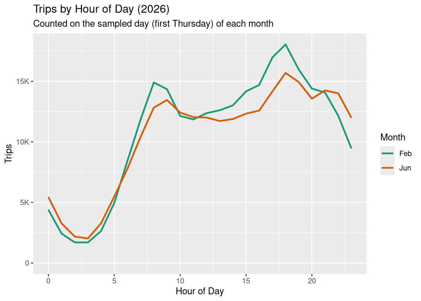
Hour-of-day dependence (rush hour surge)

The “deviation” plot shows that rush hours are charged extra over the model average. The “deviation_scale” plot multiplies deviation by the number of trips, which is also high, so rush hours bring in a lot of income.